Printable Version of Topic
Click here to view this topic in its original format
914World.com _ 914World Garage _ New Skins
Posted by: McMark Jun 30 2007, 11:18 PM
In appreciation of the kindness shown to me, I really pushed to get the complete 914 Color skin set done that was promised a while ago. I took the time to create an automated process for this. So after a bunch of work, I can now create new skin colors in a matter of minutes. 
But before I go through the whole process of making 30 or so colors, I thought we should test one of the new skins first. So, in the bottom left hand corner of this page there is a pop-up menu. Choosing Olympic Blue will bring you into the new skin, but you may need to reload the page a few times or clear your cache to see the color change. You can post here any reviews, comments, and errors.
ENJOY! 
Posted by: George H. Jun 30 2007, 11:32 PM

In appreciation of the kindness shown to me, I really pushed to get the complete 914 Color skin set done that was promised a while ago. I took the time to create an automated process for this. So after a bunch of work, I can now create new skin colors in a matter of minutes.
But before I go through the whole process of making 30 or so colors, I thought we should test one of the new skins first. So, in the bottom left hand corner of this page there is a pop-up menu. Choosing Olympic Blue will bring you into the new skin, but you may need to reload the page a few times or clear your cache to see the color change. You can post here any reviews, comments, and errors.
ENJOY!
thanks Mark


Alaskan Blue in the future please
Posted by: John Jun 30 2007, 11:40 PM
While I do appreciate your efforts, I still like the "buttons" with the Gemini Blue and the Willow Green.
Just a personal preference.
I though I would comment.
Posted by: Vacca Rabite Jul 1 2007, 12:14 AM
Dig it!
Conda Green!
Conda green Conda Green!
Zach
Posted by: markb Jul 1 2007, 12:54 AM
OOOOOOO, purty.
Posted by: rleonardccemtp Jul 1 2007, 06:08 AM
OOOOOOO, purty.
 Schweet!
Posted by: sendjonathanmail Jul 1 2007, 06:21 AM
very nice....hows about sunflower yellow 
Posted by: Johny Blackstain Jul 1 2007, 06:38 AM
Wow Olympic Blue! Get some orange highlights & we've got Gulf-Weyer colors! 

Posted by: watsonrx13 Jul 1 2007, 07:22 AM
Thanks Mark. I found this option last week and converted to blue. It's great to be able to change the colors on personal demand.
Thanks again for continuing to make this a great site to visit.... 
-- Rob
Posted by: Coy Jul 1 2007, 12:31 PM
I like the way the buttons change out too!
Thanks!
Posted by: KaptKaos Jul 1 2007, 12:34 PM
Gulf skin pls.
Posted by: SirAndy Jul 1 2007, 12:38 PM
one thing i noticed on the blue skin:
on the main forum page, with the light blue background, it's now really hard to distinguish between which posts are new and which posts are already read.
i'm guessing it has to do with the fact that both "envelop" icons are blue as well.
you might want to think about a new colorset for the envelop icons for each skin as well ...
looking good otherwise!
Andy
Posted by: Lawrence Jul 1 2007, 12:43 PM
Mark,
I think the new skin is great. 
One suggestion: look at the beta for the Guards Red skin... see how the color code is actually listed in the topic bar?
Can we add that? 
-L
Posted by: SirAndy Jul 1 2007, 12:47 PM
ha, i just saw the pink skin ...
salmonboy is going to love that one 
 Andy
Andy
Posted by: SirAndy Jul 1 2007, 12:49 PM
oh, one more thing ... can we space out the buttons for "delete/edit/quote/reply" and "on/card/pm" and "fast reply/add reply/new thread" a bit more?
now that they're smaller, they're kind of easy to miss so close together.
Andy
PS: all you need to do is add some "empty" pixels on each side. 2 per button on the left and right would probably be enough ...
PPS: also, it seems that the blue squares under the members title (and the warning level) have a gray border. that looks kinda odd ...
Posted by: watsonrx13 Jul 1 2007, 02:35 PM
BTW, when you click on the 914 info page, it stays green.... 
Again, thanks for all of the work and effort it takes to keep this site exciting...
-- Rob
Posted by: McMark Jul 1 2007, 04:50 PM
Rob, yeah, that's a larger issue. The skins only apply to the forum software. All the other site pages aren't skinnable.... yet.
Posted by: Kansas 914 Jul 1 2007, 06:36 PM
Rob, yeah, that's a larger issue. The skins only apply to the forum software. All the other site pages aren't skinnable.... yet.
Very Nice Work - but I am trying to understand why anyone would want anything other than Willow Green............. but maybe that is just me and my '72 Willow Green 914......
Thanks!
Posted by: SGB Jul 2 2007, 08:09 AM
this is GREAT! thanks.
Posted by: newto914s Jul 2 2007, 02:06 PM
Nice, thanks for the effort.
Malaga Red 

Posted by: Pat Garvey Jul 2 2007, 09:21 PM
 Nice Mark!!!!
What about aubergine!!!!???
Just kidding, but what about bahia red?
Pat
Posted by: McMark Jul 2 2007, 09:32 PM
I'll be doing all the colors (including Aubergine, Raspberry, and Sepia Brown) as soon as I finish up a few more image tweaks.
Posted by: McMark Jul 16 2007, 12:03 AM
Alaska Blue Metallic is up.
Please critique the dark post backgrounds, as well as the 'metallic'. Like/don't like, etc.
Posted by: George H. Jul 16 2007, 12:09 AM
Mark the Metallic looks great, i will get back to you on the blue background
1st impression is i like it
Posted by: jeeperjohn56 Jul 16 2007, 11:48 AM
Mark the Metallic looks great, i will get back to you on the blue background
1st impression is i like it
Hey Mark! Thanks for the metalic blue, thats the color of my car. Looks great keep up the great work your doing. John
Posted by: sendjonathanmail Jul 16 2007, 01:12 PM
I really think that the regular green is a nice style (no metallics, etc)....Im not really a big fan of the metallics -JON
Posted by: BahnBrenner914 Jul 16 2007, 01:40 PM
Diamond silver, Diamond Silver! with black trim and a couple red accents.
God I'm a selfish fellow 
Posted by: markb Jul 16 2007, 11:55 PM
I really like the metallic blue! Now how about metallic red?
Posted by: dgw Jul 17 2007, 12:01 AM
Blue is one of my favorite colors.
I just turned on the Alaska blue metallic and its the best yet.
Posted by: Lawrence Jul 17 2007, 02:26 AM
Metallic blue is very striking. Good job, Mark.
I'd like to suggest one minor tweak... scroll to the top the page.
Below, where the 914-O-World banner meets the right side of the screen, the lines don't match. Look at the bar that says "Help Search Members Calendar".
Maybe this is peculiar to my OS/browser. I'm running IE7 and XP. This issue doesn't appear in the 98-Guards Red skin.
kind regards,
Rusty
Posted by: McMark Jul 17 2007, 03:53 AM
LB,
Can you take a screenshot? It lines up fine on my screen. 
Posted by: Lawrence Jul 17 2007, 06:04 PM
Sure.
Attached thumbnail(s)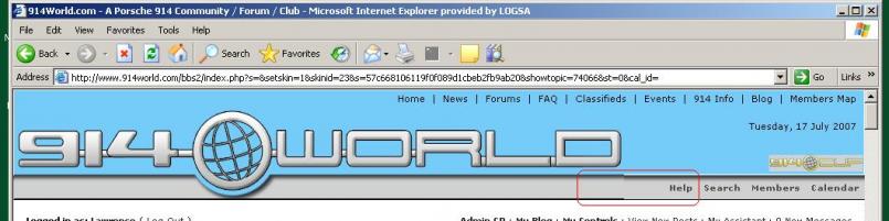
Posted by: McMark Jul 17 2007, 06:58 PM
Ah, okay. I know exactly what the problem is. Apparently IE doesn't know how big 0px is.
Posted by: Rob Ways Jul 17 2007, 11:25 PM
Dude, thanks! Making the site Olympic blue is an awesome touch for us 914 owners with the best 914 color (you can guess what that is...). Thanks again, R
Posted by: McMark Jul 24 2007, 08:41 PM
Malaga Red & Ravenna Green added!
Posted by: BigDBass Jul 24 2007, 08:46 PM
Now we're talkin'!
(Although I'm on the petition for the Wyer Gulf colors!
)
Posted by: dgw Jul 24 2007, 09:29 PM
Malaga Red & Ravenna Green added!
The Malaga red looks pink on my monitor. The 914 world banner is red, but most everything else is pink.
Firefox if it matters. color looks the same of both monitors, a Dell LCD and a Sun (sony tube) crt.
Edit - and the green is yellow. Again, the banner is OK.
Posted by: McMark Jul 24 2007, 09:34 PM
Yep. The colors for the pink/yellow sections is all generated automatically, and obviously my algorithm isn't quite perfect. 
Posted by: skline Jul 24 2007, 09:54 PM
I think you need to have YELLOW as an option, There are many yellow 914's out there. For instance at this run one time.................................
Attached image(s)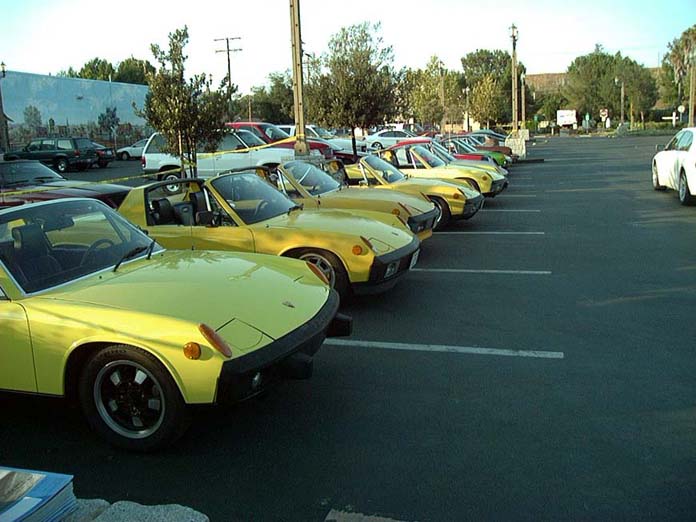
Posted by: plymouth37 Jul 24 2007, 10:35 PM
Nice work! You should make a yellow skin, I hear it will make the pages load faster!
Posted by: sendjonathanmail Jul 24 2007, 10:39 PM
agreed
Posted by: McMark Jul 25 2007, 01:57 PM
Okay, okay. Yellow later tonight.
Posted by: BigDBass Jul 25 2007, 09:19 PM
Hey Mark, thanks for v2 of Ravenna, it looks much better. (I had been using v1 out of loyalty to my color regardless.)
Posted by: Johny Blackstain Jul 25 2007, 09:32 PM
regardless of my color preference, my eyes adore Gemini Blue . easiest on my eyes by far .
Posted by: McMark Jul 25 2007, 10:25 PM
Yeah, I reworked the algorithm for how the other colors are determined. It's better. But still not perfect.
Posted by: dgw Jul 25 2007, 10:47 PM
Green is green now, looks much better. Red is different and better, but i would still call it closer to pink than to red.
You are doing good work, I cant wait for yellow.
Posted by: McMark Jul 25 2007, 11:44 PM
Red will probably always be pink. When you make green lighter you get light green, when you make blue lighter you get light blue, when you make red lighter you get pink. 
But I agree with you.
Posted by: Mountain914 Jul 26 2007, 12:04 AM
Wow - we do enjoy !! Thank You!, you have been putting an awful lot of effort into this, you rock !!
Do you use the "web safe colors" (guessing no ) and I don't know how you create these, but if you use the standard codes, I have created the following 216 web safe colors palette here:
http://members.rennlist.com/mountain914/ColorPalette.html
Posted by: McMark Jul 26 2007, 10:57 AM
Okay, folks. Canary Yellow is UP! I tried to pick a yellow that didn't quite burn your eyes out.
Posted by: 1970 Neun vierzehn Jul 26 2007, 11:49 AM
Nice work, I (we) sure do appreciate all the work that I'm sure goes into this. Thanx especially for L11E
Paul
Posted by: skline Jul 26 2007, 11:53 AM
Canary Yellow is just fine by me, it is up on the screen now, Thank you Mark, your efforts are being utilized on my end and appreciated.
Posted by: Ferg Jul 26 2007, 12:33 PM
Cough Cough Signal Orange and Irish Green
Posted by: markb Jul 26 2007, 05:20 PM
Wow.
Nice work.
Posted by: Mountain914 Jul 26 2007, 11:40 PM
Canary Yellow is my new fave !!
I gotta push for signal orange, too, will it be in our future ??
Posted by: SGB Jul 27 2007, 02:14 PM
They are ALL great!
Jeeze, when you are through, is there any hope of having a "rotate" or "random" option?
How do-able is that?
Posted by: BigDBass Jul 28 2007, 11:51 AM
Mark, FYI the banner in Ravenna is now blocking the "Searc" of the "Search Members Calendar" links.
Posted by: skline Jul 28 2007, 04:27 PM
Mark, FYI the banner in Ravenna is now blocking the "Searc" of the "Search Members Calendar" links.
Picky picky picky
Posted by: BigDBass Jul 29 2007, 12:59 AM
Nah, just helping troubleshoot!
Posted by: McMark Jul 29 2007, 02:12 AM
Nah, just helping troubleshoot!
Posted by: Pat Garvey Jul 29 2007, 09:57 AM
Nice work Mark!
I hate to say it, but I like the yellow best - easiest on my eyes. As much as I was waiting for red, it sort of hurts to look at for very long.
Pat
Posted by: Toast Jul 29 2007, 01:30 PM
The Yellow is awesome! I can read all the words and its not blinding either!
Thanks!
Posted by: Racer Chris Jul 30 2007, 07:18 PM
I came across a minor issue with the yellow skin. In the box of added attachments (on the reply to post page) the small italic text below the attachments is nearly invisible - yellow on white.
Powered by Invision Power Board (http://www.invisionboard.com)
© Invision Power Services (http://www.invisionpower.com)